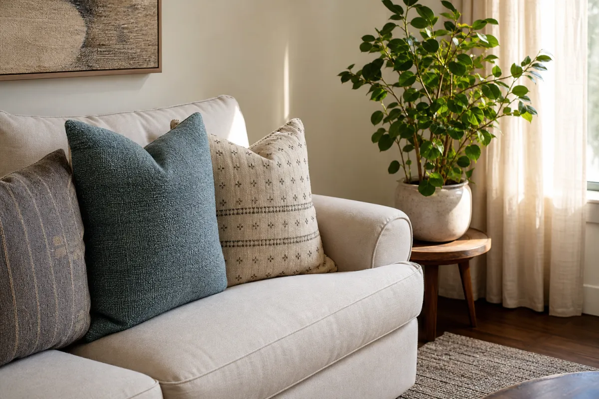
Choosing the best paint colors for a living room makeover is less about chasing a single viral swatch and more about light, undertones, fixed finishes, and how you actually use the room. A color that looks calm in a north-facing parlor can turn gloomy in a basement lounge; a warm white that flatters oak floors can clash with cool gray tile.
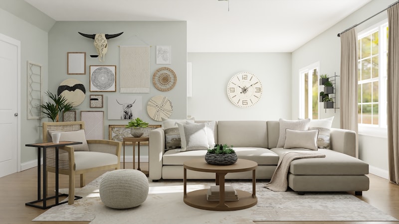
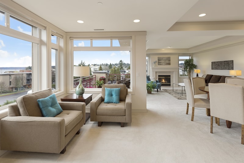
This guide gives you a practical selection method, color families that perform well in real living rooms, testing protocol, common mistakes, and safety notes for prep and ventilation—without fake “designer secret” theatrics.
Quick answer: how to pick a living room color that works
1. Read the light (north/south/east/west, tree cover, window size)
2. List fixed elements you will not change (floor undertone, sofa, stone, brick, trim material)
3. Choose a direction: soft neutral, warm earth, cool calm, deep moody, or gentle color (green/blue/clay)
4. Sample large on multiple walls; view morning, afternoon, and lamp light
5. Decide sheen for durability and photography of imperfections
6. Plan trim and ceiling as part of the scheme, not afterthoughts
The “best” color is the one that still looks good on a cloudy Wednesday with the TV on—not only at golden hour for photos.
Start with light and orientation
North-facing rooms
Light is cooler and more indirect. Soft whites with gentle warmth, greige with brown undertones, and muted earth colors often feel cozier than icy grays. If you love cool colors, compensate with warm wood, lamps, and textiles.
South-facing rooms
Abundant light can handle cooler neutrals and clearer colors, but intense sun can also bleach the feel of very light pastels. Test for glare and washed-out midtones.
East and west rooms
East rooms shift from bright morning to calmer afternoon; west rooms can go amber in evening. Check samples at the time of day you use the living room most.
Low natural light
Prefer mid-value colors with life, layered lamps, and avoid relying on pure cool gray to “brighten” a dark room—it often just looks dull.
Undertones: the make-or-break skill
Paint chips lie in isolation. Undertones show up next to your floor and sofa.
- Pink/peach undertones in “greige” can fight orange oak or love creamy textiles
- Green undertones in gray can feel sophisticated next to plants and black metal—or sickly next to cherry wood
- Violet undertones in cool grays are a common surprise under LED bulbs
Always sample beside the largest fixed surfaces: flooring, rug, fireplace, major seating.
Color families that reliably support living room makeovers
1) Soft warm whites and creamy neutrals
Best when you want airiness without sterile showroom vibes. Pair with textured fabrics. Watch yellow spike under warm bulbs.
2) Greige and taupe
The bridge between gray and beige. Excellent for open plans that must not clash with kitchen finishes. Sample carefully—greige is undertone city.
3) Warm earth (clay, putty, mushroom, soft terracotta-adjacent)
Great for cozy makeovers and media rooms. Balance with lighter curtains so the room does not cave in.
4) Calm greens (sage, olive-muted, eucalyptus)
Living rooms love muted green because it connects indoor seating to outdoor views. Keep chroma low if the room is small.
5) Blue-grays and slate
Classic with white trim and coastal or modern furniture. In dark rooms, choose versions with a bit of warmth or boost lighting.
6) Deep moody colors (ink, forest, chocolate)
High impact for adult living rooms and TV spaces. Use on all walls or a controlled focal wall; plan lighting first. Matte deep colors show scuffs differently than midtones—accept maintenance reality.
There is no universal champion swatch. There is a best family for your light and furnishings.
Open-plan living rooms: paint strategy
If living, dining, and kitchen share sightlines:
- Prefer a unifying neutral envelope with color in furniture and art, or
- Use one confident color in the living zone with careful transitions at architectural breaks
- Avoid three competing wall colors in one visual field unless you are intentionally zoning with architecture
Ceilings and trim continuity often matter more than people think for open plans.
Sheen, durability, and real life
Living rooms need cleanable surfaces without looking plastic.
- Matte/eggshell-ish finishes hide wall flaws and look modern; check washability claims for your product line
- Higher sheen on trim for durability and definition
- High-traffic family rooms may need more washable formulations
Always follow the specific paint system’s recoat times and primer requirements—especially over stains, glossy old paint, or patched drywall.
Testing protocol that prevents expensive regret
1. Buy samples of 2–3 finalists, not twelve
2. Paint large boards or big wall patches (not tiny dots)
3. Move boards around walls and corners
4. View with curtains open/closed and lamps on
5. Live with them 48 hours if possible
6. Only then order full quantities from the same batch when you can
Photographing samples can help, but trust your eyes in the room more than phone white balance.
Coordinating trim, ceiling, and accent moves
- Trim whiter than walls is classic and crisp
- Color-drenched (walls/trim close) feels modern and cocooning
- Ceilings slightly lighter than walls can lift; bold ceilings are advanced mode
- Accent walls work when architecture supports them (fireplace wall, niche), not as random paint stickers
Common mistakes
- Picking color from a 1-inch chip under store lighting
- Matching the sofa exactly (can look flat); coordinate instead
- Ignoring existing floor undertones
- Painting over dirty, glossy, or unrepaired walls
- Using cool gray to “modernize” a warm-wood traditional room without transitional textiles
- Forgetting exterior light changes by season (trees leaf out and darken rooms)
Budget and sequencing for a makeover
Paint is high impact per dollar when prep is honest:
1. Repair holes and cracks
2. Clean walls
3. Prime where needed
4. Cut in carefully; maintain wet edges
5. Restyle textiles after paint, not before you lock the color
If floors will be refinished soon, consider final floor tone before committing to wall color.
Safety and healthy-application notes
- Ventilate during and after painting; follow product label guidance
- Use appropriate respirators/masks when products require them—especially spraying or using higher-VOC materials
- Keep kids and pets out of wet work zones; store cans sealed and out of reach
- Ladder safety matters for stair-adjacent living walls—have a spotter when needed
- Dispose of leftover product per local rules; do not pour down drains
- If you suspect lead paint in older homes, follow lead-safe practices and hire qualified help rather than dry-sanding hazards
DIY is fine for many walls; hire pros when height, lead risk, or flawless spray finishes exceed your skill.
Quick reference: choose by goal
| Goal | Lean toward | Watch out for |
|---|---|---|
| Brighter feel | Light warm neutrals + better lamps | Cool gray in dark rooms |
| Cozy media room | Earth midtones or deep hues | Too dark without lighting plan |
| Open plan unity | Shared greige/taupe envelope | Too many accent walls |
| Nature connection | Muted greens | High-chroma greens in tiny rooms |
| High contrast modern | Deep walls + pale trim | Scuff visibility on deep matte |
FAQ
What are the best paint colors for a living room makeover in small spaces?
Light-to-mid neutrals with gentle warmth, or muted green-gray, usually keep small rooms from closing in. Use mirrors and layered light. Deep colors can work if you embrace the cocoon and light it well.
Should living room paint be warm or cool?
Match the dominant fixed materials. Warm floors often prefer warm or balanced neutrals; cool stone may support cooler walls. Mixed materials need careful sampling.
How many colors should I sample?
Two or three serious finalists is enough if you already filtered by light and undertone. Too many samples creates decision fatigue.
Do I need to repaint trim?
Not always. Fresh walls next to dingy trim can look unfinished. Cleaning and a trim refresh often elevates the whole makeover.
Can I paint only one wall?
Yes if that wall is architecturally meaningful. Random single walls without a focal reason can look like leftover paint.


Share your results
Reader transformations
Have you tried this makeover? Share your experience below.